
Want More Sales from Your Ecommerce Website? Start With This (Hint: It’s Not More Traffic)
Okayyyy let’s get something straight:
If your first thought when sales are slow is “I need more traffic!”—I’m gonna lovingly stop you right there.
More traffic to a meh website just means more people seeing your broken funnel.
What you actually need?
To make more sales from the traffic you’re already getting. Period.

Here’s where we start: your homepage.
Your digital shopfront. Your conversion queen. Your money-making MVP.
And so many product-based businesses are getting it so wrong.
So let’s break down the essential homepage elements that make people go from “just browsing” to “take my money.”
HOME PAGE
1. A Clear-As-Day Statement Above the Fold
Within 2 seconds of landing on your site, I should know:
- What you sell
- Who it’s for
- Why I should care
This needs to be front and centre, above the fold—aka before I scroll.
Got a hero image? Great. Use a headline and subhead combo that spells it out.
Example:
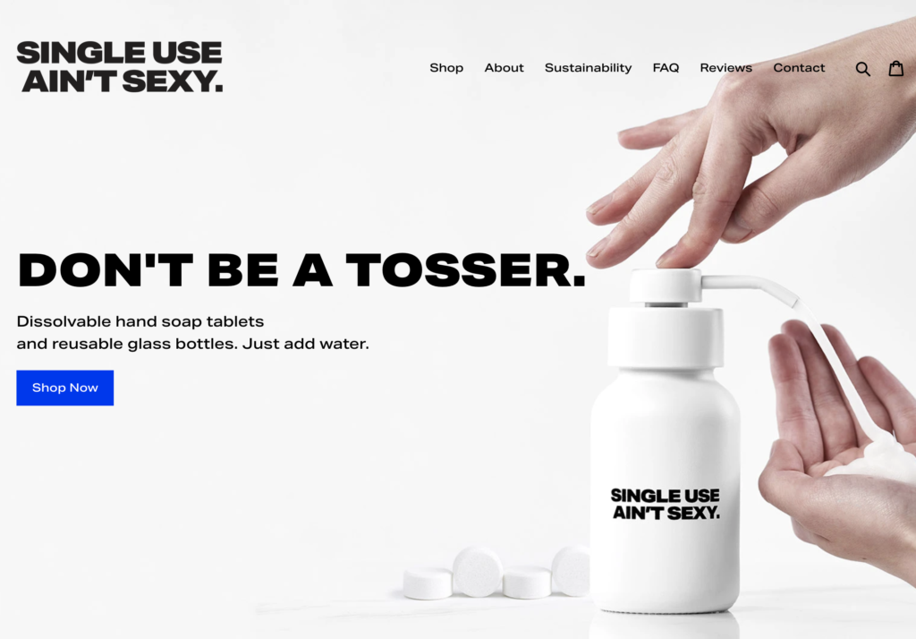
🧼 Single Use Ain’t Sexy nails it with their message about dissolvable soap tablets that reduce plastic waste. Straight up, no fluff.
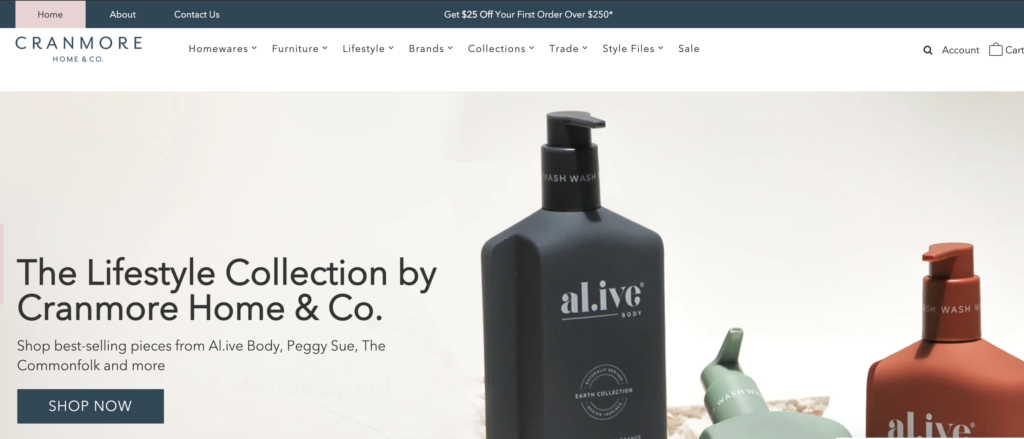
If you’re a lifestyle store with a bunch of brands, use an image that reflects the style of your store.
- Boho and earthy? Feature A.Live Body or Karina Jambrak-style tones.
- Bold and fun? Hello Kip & Co energy.
Your image + your headline = your vibe in 5 seconds or less.
Take this image for example. The Single Use Ain’t Sexy are dissovable hand soap tablets that replace the need to buy new plastic bottles regualarly. In their subheading they explain just that.
If you are a lifestyle store with lots of different brands and types of products then your image should showcase this with a brand image that showcases the style of your store well. Example if you are bright and colourful then having a Kip and Co image on the front will showcase that. If you more of a boho natural store then having an image with that colour palette is imporatant. i.e you may use a Karina Jambrak or a A.live body image that has the the tones that represent you. Or it may be shown in your logo or within your menu *(showing what you sell).
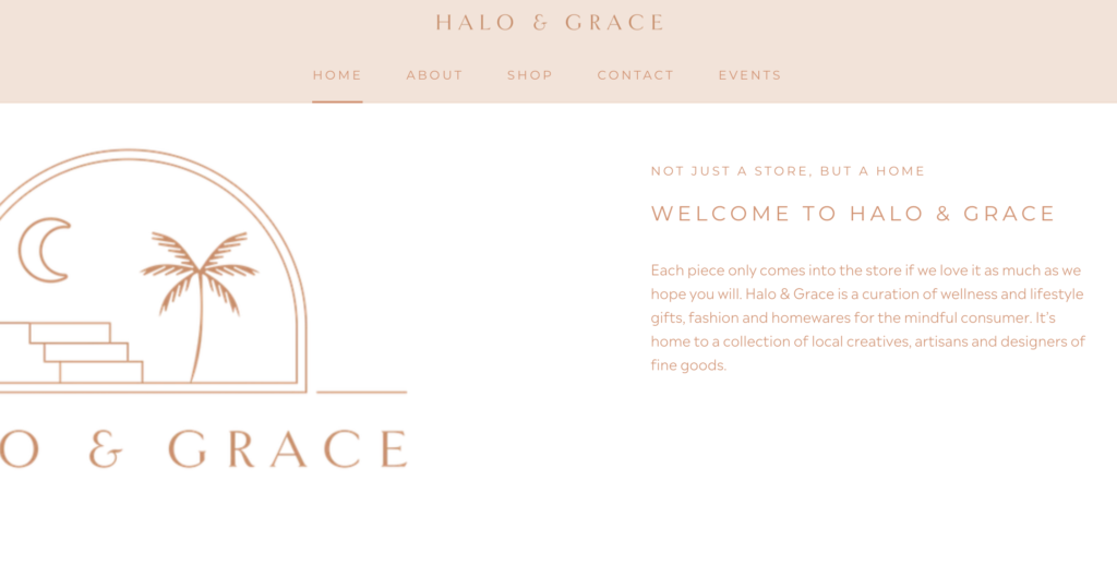
You may use the next section of your website to give a brief desciption of what you sell or your unique point of difference. LIke Halo and Grace here.
2. A CTA That Doesn’t Play Hide and Seek
I beg you—no more pastel buttons that blend into the background.
You NEED a high contrast, in-your-face, impossible-to-miss Call to Action.
Whether it’s SHOP NOW, VIEW COLLECTIONS, or GET STARTED, make it obvious and make it clickable.
Don’t worry if it’s not “on brand.” If no one clicks it, it doesn’t matter how pretty it is.

3. 3. A Menu That Actually Helps Me Buy Something
If your nav bar just says SHOP and that’s it?
Nope. Try again.
Give your customers categories. Give them clarity.
List your key collections across the top and drop-downs beneath that go deeper. Show me what’s new, what’s trending, or what’s on sale.
💡 Pro tip: Only put money-making links in your main menu.
Move the fluff—like About, Contact, Wholesale—down to your footer.
Want examples? Check out the absolute masters:
👉 Jumbled
👉 Suku Home

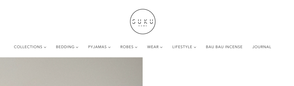
If you do only sell the one thing then I can maybe forgive you for having the word SHOP only!!
Ideally when it comes to clear navigation, it’s very simple: put only money-making links in your main navigation—meaning only provide links to locations where people can buy something. All your other things can be in your footer. Like contact, wholesale, about etc…..
4. A Search Bar That’s Screaming “Use Me”
A tiny magnifying glass icon is not enough.
Make your search function obvious and accessible. Big, bold, and in plain sight.
Why?
Because people who search are usually ready to buy.
Bonus tip: check your Shopify Reports and Google Analytics for search terms customers are typing in. You might spot:
- Products they want that you don’t stock (hello opportunity)
- Search words that aren’t converting (hello copy fix)
- Ideas for future categories or homepage content
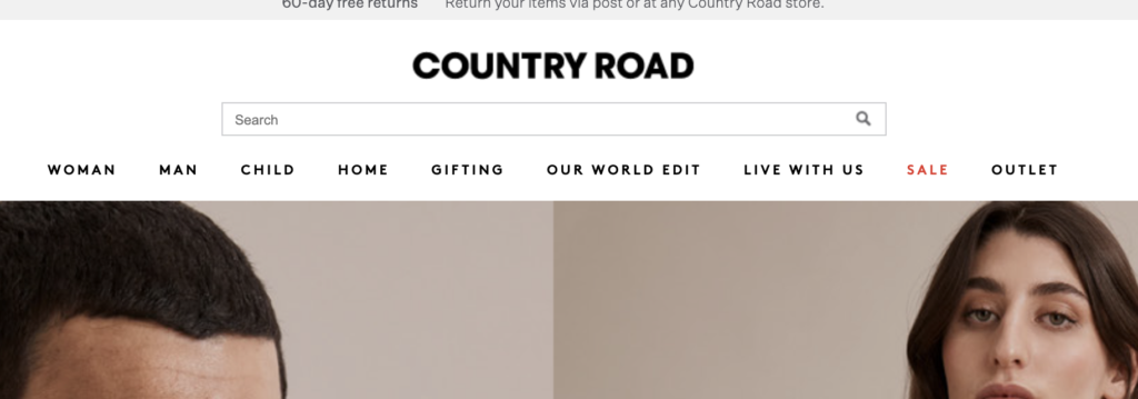
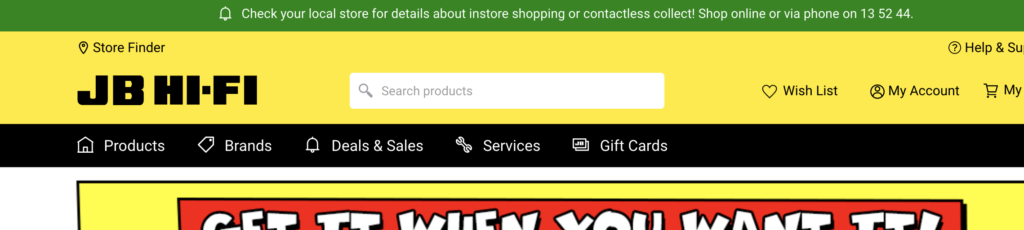
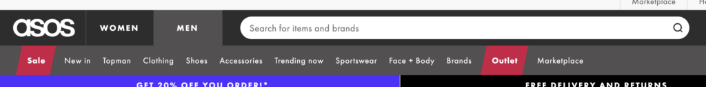
If you have a look at all the worlds top ecommerce sites they have huge search bars across the top. This is for a REASON!! They work and they help increase sales. End of story.
See examples here from Amazon, JB Hifi (one of Australia’s best performing ecommerce stores) Asos, Country Road.

Depending upon your theme it may already be available or at the very least you should dd the word search next to the icon so it is really obvious.
Different themes show different options. Get in touch with whoever created your theme (ie either Shopify if free theme or the theme developer) or google “your theme and how to add search option”.
5. Imagery That Sells Without Saying a Word
You cannot sell premium products with pixelated pics and bad lighting.
Great imagery is not optional—it’s your entire sales pitch.
This goes for both:
- Product images (clean, clear, consistent)
- Lifestyle images (aspirational, on-brand, mood-boosting)
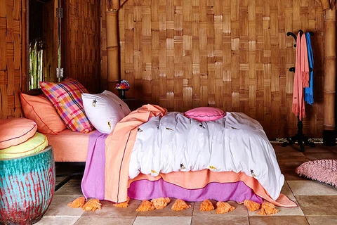
Stockist brands like Sage and Clare or Kip and Co set the gold standard here.
And if you’re a retail store? Get some custom shots taken in your space. Even if it’s just a few! It sets you apart from every other store selling the same brands.
Kip and Co and Sage and Clare do an amazing job with their imagery.
Ready to Turn “Add to Cart” into “Checkout Complete”?
Your homepage is only the start. Want to know exactly what else to tweak on your site to convert more browsers into buyers?
Grab my Add to Cart Accelerator – your instant access to the 5-day mini training that shows you exactly how to increase conversion and boost website sales, no extra traffic needed.
🚀 Short, punchy, no-fluff strategies you can implement immediately
💻 Perfect if your traffic is okay-ish but your sales aren’t stacking up
💸 Only $27 usd (seriously, it’ll pay for itself in a single order)
Or if you’re ready to go ALL in on increasing sales from every angle (eComm, wholesale, email marketing, and more), get yourself inside my Get More Sales Bundle – the ultimate toolkit for product-based business owners who are ready to finally make consistent sales without working 24/7.
Because you don’t need to do more.
You just need to do what actually works.
Let’s get those sales rolling,
xo Melissa

Comments +